 It has been almost a year since ADHS launched our COVID-19 dashboard. Since then, our dashboard has undergone many enhancements and has had new sections added. Our reporting regarding this disease continues to evolve as we collect additional data and learn about which data elements are most useful to understand how COVID-19 is impacting Arizonans. Over the course of this response, our Data Dashboard has evolved to display new elements in an understandable format based on the various types of COVID-19 data the department receives.
Here’s an update on some exciting changes to the dashboard.
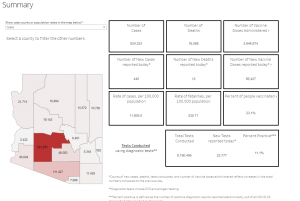
Summary Page Updates
Our summary page has been updated to include elements that we think have the biggest impact on the course of this pandemic. The data on cases and deaths remains unchanged, but now we are reporting the total tests administered and using the percent positivity from the total number of tests, have removed the serology data, and have added current vaccination data. The elements that were removed from the summary page, including the serology results and the laboratory data from unique persons, can still be found on the appropriate pages of our dashboard.
Race and Ethnicity Vaccine Administration Data
Some of the important elements for planning vaccine administration activities are our ZIP code and race/ethnicity data to ensure we are allocating vaccine in a fair and equitable way. We have updated our race and ethnicity to provide more specific and complete information. The updated table breaks out “other” from “unknown” and adds specific ethnicity (Hispanic/non-Hispanic) categories to provide additional clarification on vaccinated individuals.
COVID-19 Vaccinations by ZIP Code
In addition to seeing the number of vaccinations administered to residents of each ZIP code, we have added new elements to provide more information and to make the data more useful. In the upper right corner of the map, there are two buttons. One looks like a magnifying glass and the other looks like a stack of squares. If you click on the little box with the stack of squares in it, it will give you the ability to add layers to the data. You can select layers on the ZIP zipcode map to show the percentage vaccinated among those over 65 and over 18.
Vaccine Prioritization Page
We know that risk of hospitalization and death significantly increases with age. Arizona recently adopted an updated hybrid prioritization that focuses on those that are at high risk for bad outcomes due to COVID-19 and getting them vaccinated as quickly as possible. We also added a Vaccine Prioritization page to our data dashboard. In order to track the progress through each of the age and priority groups, we added a new Vaccine Prioritization page. This shows the percentage of each of the populations (1A + prioritized 1B, and each age category) that have received at least one dose of vaccine. The current recommendation is to progress to the next age group when a county or the state hits 55-60% of the age group vaccinated. This is also filterable by county, to allow Arizonans to determine how close their county is to advancing into the next age category.
Please visit the COVID-19 dashboard to view the dashboard updates and get more info about our COVID-19 response on our website.


Social Media