


With the recent announcement of our COVID-19 dashboard enhancements, I’d like to share some tips and tricks for getting the most out of the dashboard. Our amazing dashboard team has created the ability to view the data in all kinds of different ways, some of which I’ll summarize below.
Summary page
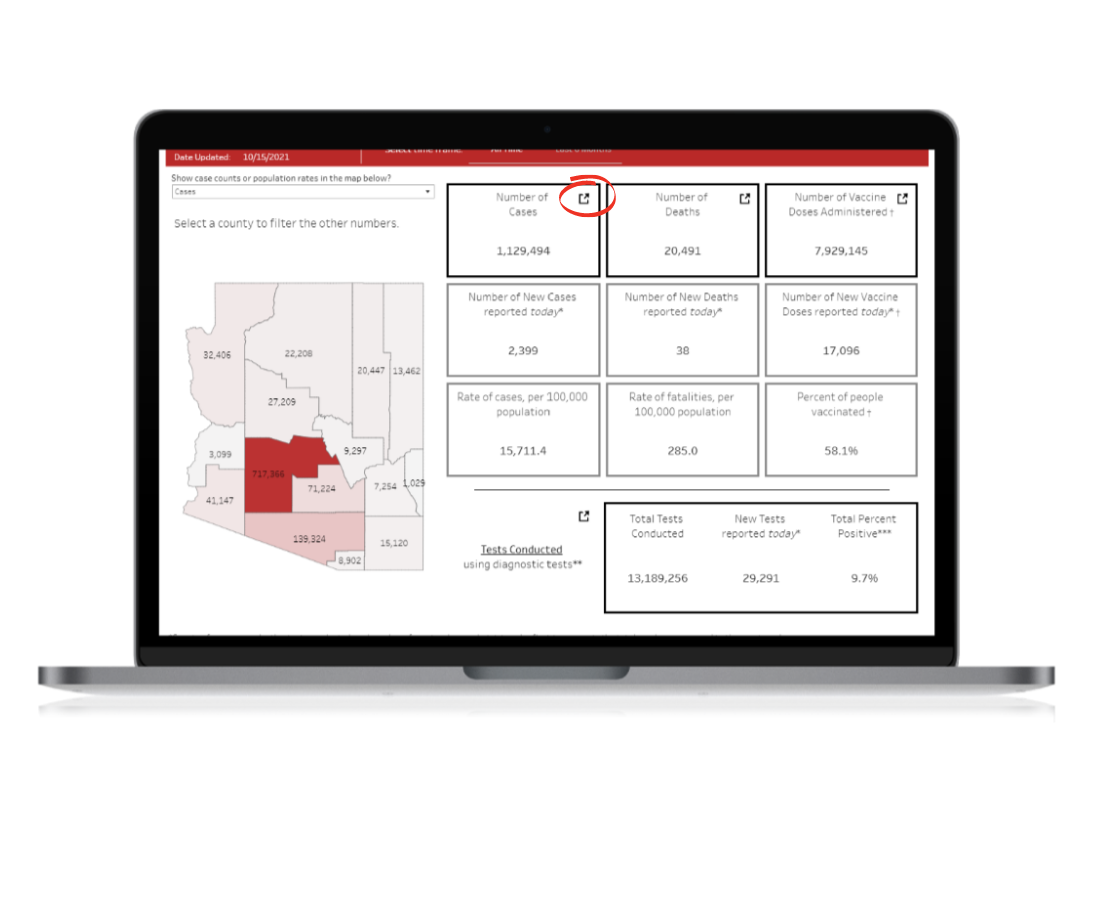
You can now go straight from the Summary page to our most visited pages by clicking the symbol in the top right corner of some of the boxes. 
Also, note that the “Number of New Cases reported today” is not reflective of the number of people newly sick with COVID-19 today. It’s actually telling you how many people were reported to public health with COVID-19 in the last day. If you want to see how many people became sick with COVID-19 on a given day, you’ll need to look at the COVID-19 Cases by Day section of our dashboard.
Filtering by county
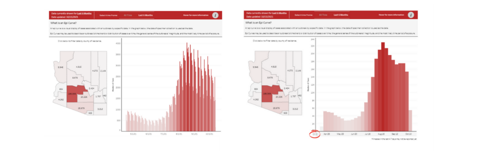
Any page on the dashboard with a map of Arizona allows you to filter the data by county. If you click on a county, you can see data for just that county.
Showing weekly, monthly, or quarterly data
If, like me, you prefer to view weekly trends instead of daily trends, you can update the bar chart on several dashboard pages to show you weekly data. You can do this by hovering over the farthest left portion of the x-axis of the chart and clicking the small (-) sign that pops up. Clicking the (-) sign once will collapse the data from daily to weekly, clicking it twice will collapse the data to show it by month, and clicking it three times will collapse the data to show it by quarter. This can be helpful if you want to compare different weeks to one another or compare a month in 2020 to a month in 2021. I do this the most often on our COVID-19 Cases by Day and Laboratory Testing pages.
Determining current percent positivity
We use the percent of the diagnostic tests in Arizona that are positive as a measure of community transmission during a given time period. Y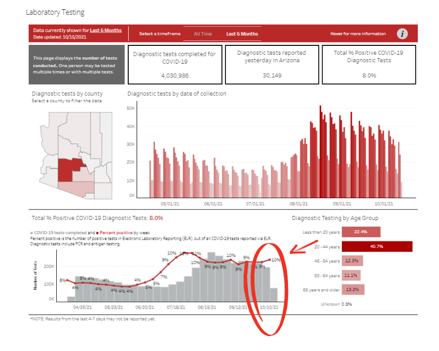 ou may have noticed a couple of different measures of percent positivity on our dashboard. One, displayed on our Summary page and at the title of the percent positivity bar graph on our Laboratory Testing page, shows total percent positivity. That means it’s displaying the total number of positive diagnostic tests over the total number of all diagnostic tests performed in Arizona over the entire pandemic. This is a good overall metric, but if you want to know what’s happening in Arizona right now, you can visit the Laboratory Testing page and take a look at the bar graph at the bottom left of the page. This graph shows the percent of diagnostic tests that are positive each week. Looking at the most recent complete week will give you the best picture of the current percent positivity in Arizona.
These are just some of the ways you can interact with the dashboard, but hopefully, a helpful summary to enhance your experience.